 |
| Blank slate. Ahhhh. |
When we moved in, the room was pretty much ready to go. So we slapped some of our good ol' Kilim Beige from Sherwin Williams on the walls and plunked our furniture down in it. The piano was centered on the only interior wall- the one on the left (it can be bad ju-ju for pianos to be on exterior walls, expanding and contracting with the temperature changes outside). Then came time for tough decisions. The cable outlet is in the far corner, next to the window. The window sill was much lower than our couch and overstuffed chair. And our couch had one chaise section. Have you ever played Chinese number puzzles? Yeah, that's what this was. After six months of rearranging and rearranging, we still had not figured out a way to set up our furniture that worked for people who didn't like to crane their necks to the far right to watch TV or hop over the chaise lounge to get to the kitchen.
It finally occurred to me that we had been thinking about this room all wrong. The focal point had to be the piano. It's a piano, for pete's sake!! That meant that it would need to live on the center wall, and I would just have to risk damaging it. I rationalized that the temperature swings aren't so extreme in Western Washington, and it probably wouldn't cause any problems that a tuning wouldn't fix. So then where would the TV go? Well, Ashli at The Mini Manor Blog had my answer:
 |
| Low shelf in the corner, dahhhhling. |
It'd be right next to the cable outlet, and would still let the piano be the star of the show. The rest of the room fell into place pretty easily- I think because Ashli's living room is almost the same shape as mine (hooray for copying other peoples' ideas!).
Our beloved super-comfy couch with chaise (the first piece of new furniture we ever purchased) had to go, and the awesome overstuffed purple chair I found on criagslist with it. We got a low bookshelf from Target's nursery section during a great sale and put it you-know-where.
 |
| Nobody puts baby in a... never mind. |
I got an awesome deal on a pair of faux-leather club chairs I had been eyeing on Overstock and Steve found a rug that he insisted we get for the room (it was an amazing deal- $70 for a 9' x 11' rug). I doubled up coupons and got an industrial cart-style coffee table from World Market for over half off. And we got a couch from Macy's during their President's Day Sale- opening a card with them got us another 15% discount, so we ended up paying about half price. I was not sold on the gray fabric but Steve talked me into it and I'm so glad he did. It's a nice contrast to all the brown and white tones we have going on in the room.
 |
| Well hey, it's a living room. |
Another piece we wanted display prominently is the grandfather clock. It belonged to Steve's grandfather and became ours when he passed. He was an incredible man, so we like having this reminder of him where we see it often. Although, in the interest of full disclosure- one of the weights fell during the moving process and punched a hole through the base of the clock. Getting it fixed and serviced is on our long list of projects to do.
And then there was the picture window to deal with. Although it is a great design feature, it is maddeningly off-center on the wall. We decided to try a visual trick to help deal with it. We centered our curtain rod on the wall- NOT the window- and hung it at 96" high. It ended up working really well! We simply have the curtains on one side spread out further to cover the portion of wall. This creates the illusion that the window is centered on the wall. The visual camouflage works even better when it's light outside- you don't notice the wall behind the sheers at all.
 | ||
| Why are they called club chairs when they are used in living rooms? |
The mirror above the piano is still a little too low- I would love to have a mantel or something to give my small piano more oomph. I would also love to have a couple of trays to corral our magazines and remotes- they seem to spread and multiply every time we have family couch time. I have been looking at some but I have yet to find the perfect one. I've been considering DIYing one, we'll see if that comes to fruition!
Now comes my two favorite parts of this room. One is here:
 |
| Restoration Hardware much? |
Steve recently discovered he has some major woodworking skills. "Recently" meaning about 3 months ago. We had been looking for a small table to sit between the low club chairs. After coming up empty-handed, I found plans for one that I loved on Shanty 2 Chic and Ana White. Steve agreed to give it a go and we ended up with the coolest Restoration Hardware knockoff nightstand ever. Agreed? Yeah, I knew you would.
 |
| The Kenwood Nightstand. Saved us $300 and we uncovered Steve's hidden talents. |
My other favorite part of this room can be found in this picture. Well, my favorite part besides Indiana Jones the wiener dog. And no, it's not the picture-less frames (but I am really excited about that project- more on that later).
 |
| Two of these things are not like the others. |
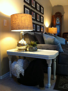
It's these adorable end tables!! This was Steve's first attempt at making furniture. No plans, just a picture in his head and some rough measurements. I love that he used trim for the edging, it made the tables have tray tops (it looks cool and will come in handy for corralling peanut butter M&Ms on game nights).
These little guys were painted in Valspar's Homestead Resort Pale Olive. After 2 coats of that had dried, I distressed with wax, which is a fancy way of saying I rubbed it with an unscented white candle- hard. Then came two coats of Valspar's Woodrow Wilson Presidential White. Once the white paint dried, I simply rubbed all the wax off with a kitchen knife, exposing the green under the distressing.
 |
| Super easy subtle distressing. |
That's about it for the living room now. We have some more bits and pieces to go, but mostly we are quite happy with how comfortable, inviting, and personally pleasing this room is for us.
Isn't it fun watching someone discover skills they never knew they had? I hope Steve continues making furniture for many years to come just so I can enjoy watching him try new things and improve himself. What can I say, teacher Colleen is always near the surface.


No comments:
Post a Comment